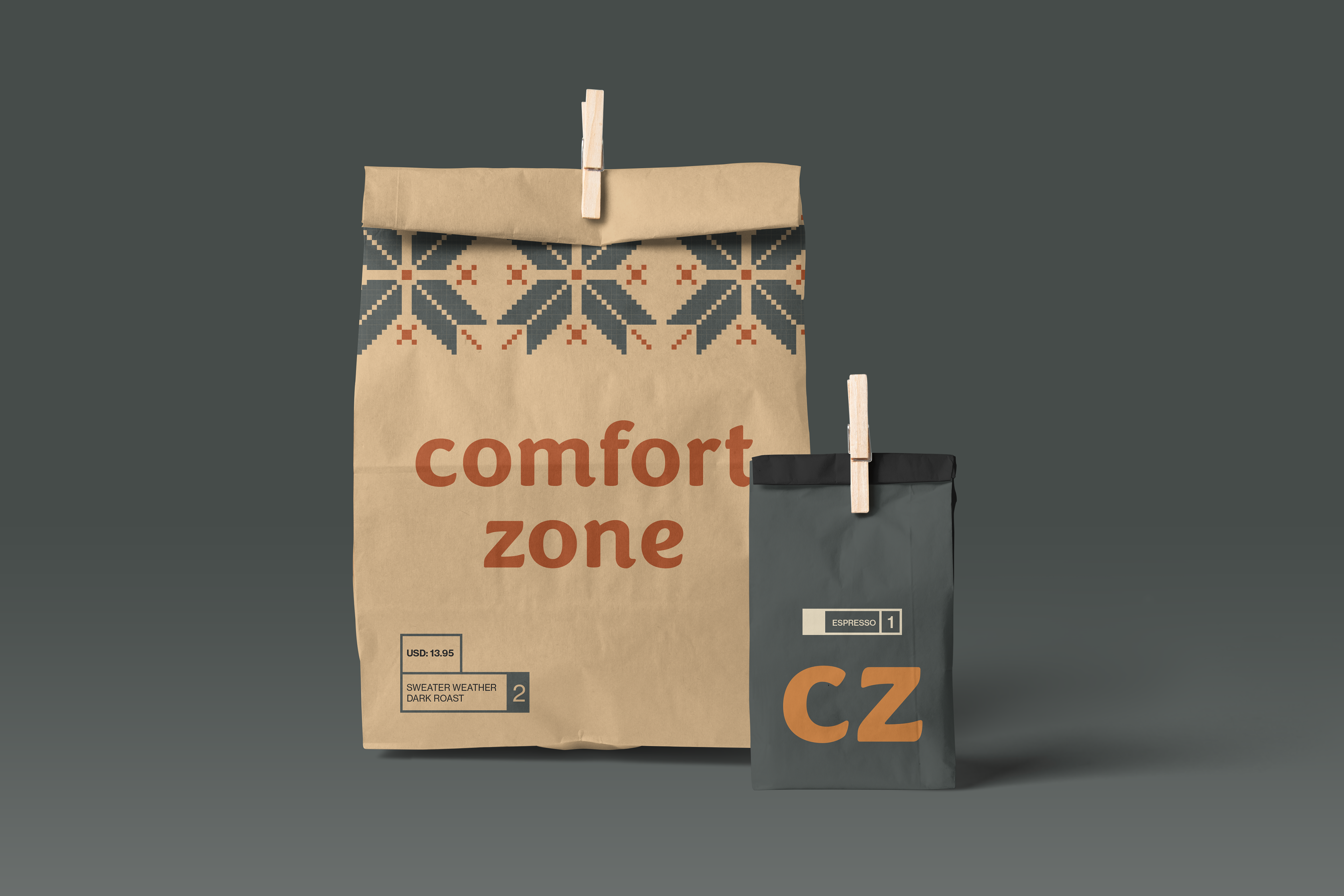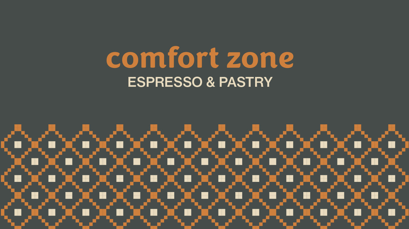
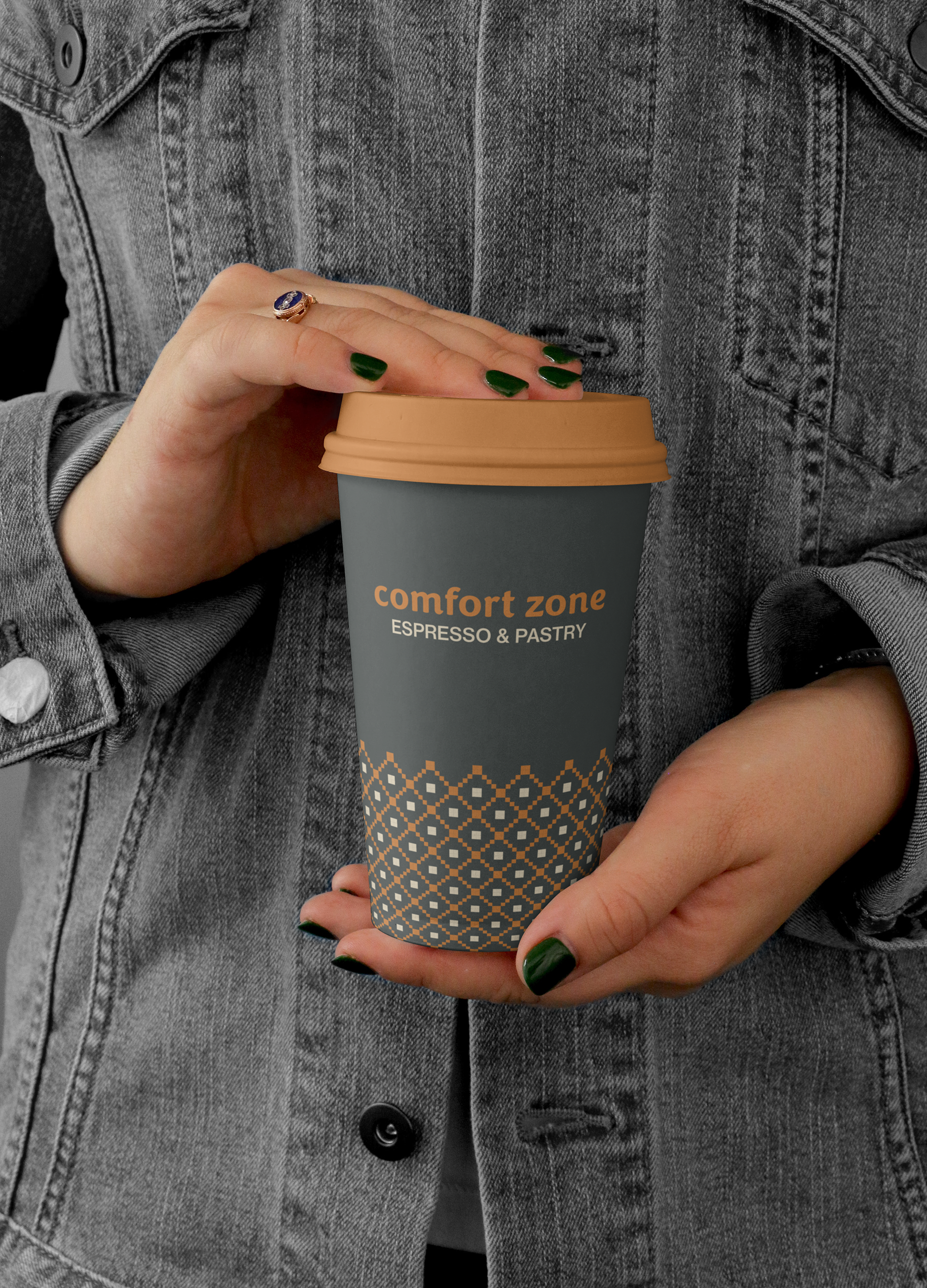
I came up with the idea of a Fair Isle sweater design to add to the warmth of the overall branding. This design is meant to be used on to-go cups and other branded products you could buy in-store such.
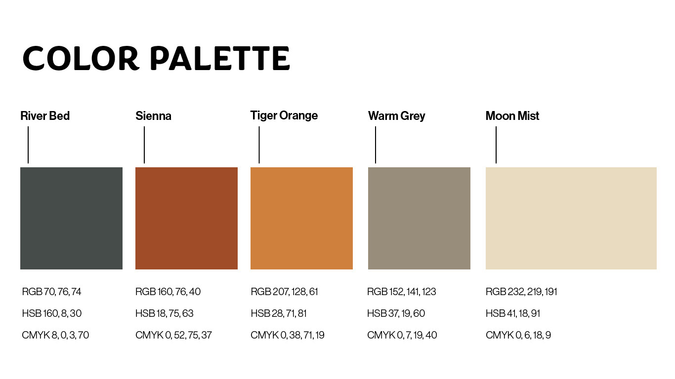
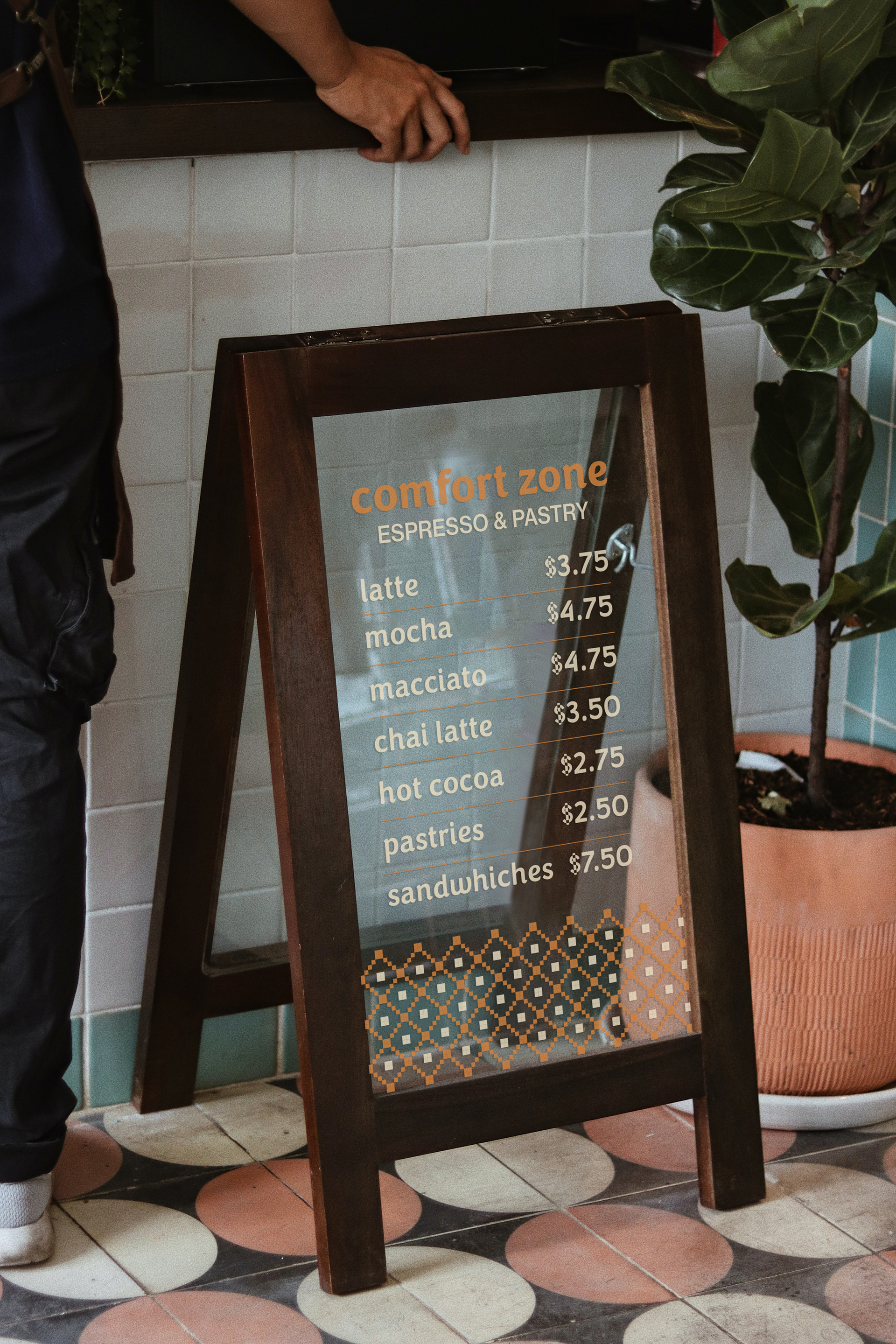
For the color palette, I selected warm colors which would stand out well against each other. River Bed and Tiger Orange are complementary colors and meant to be used as the brand's main colors.
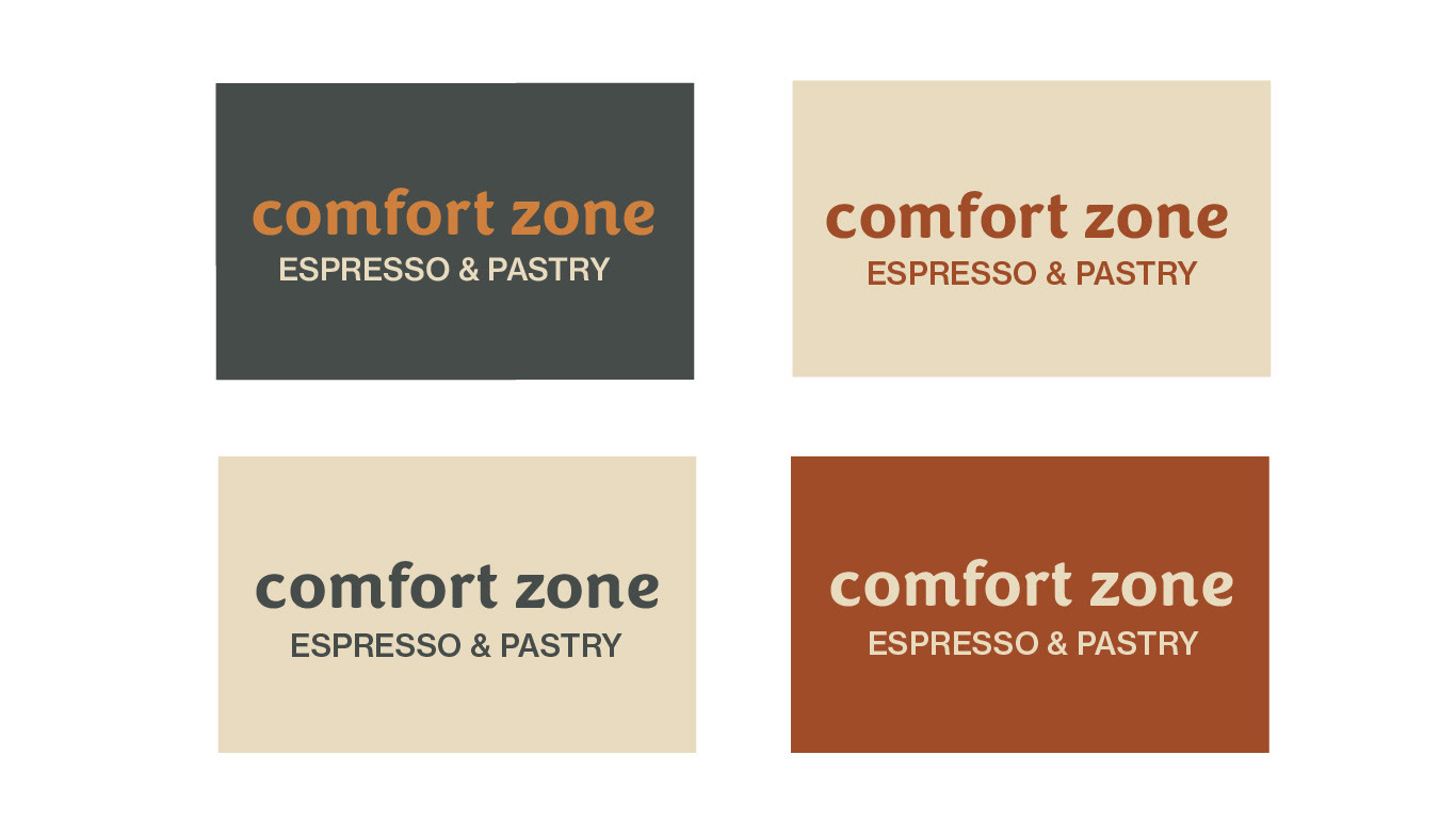
I created these to showcase different ways the color palette could be used.